
Summary
✓Reviewed by Emma Thompson The New Company's energetic identity system for LoL Esports stands as one of the most deliberate and consequential rebrands in competitive gaming history. When Riot Games brought in the San Francisco-based strategic design studio to overhaul...
Table of contents
- 1 What The New Company Built for LoL Esports
- 2 The Brief: Avoiding Fantasy-Gaming Tropes
- 3 Background: How LoL Esports Branding Evolved Before The New Company
- 4 Design System Architecture: How the Identity Scales
- 5 Regional Identity Systems: LEC, LCS, and LCK
- 5.1 LCS: A Decade of Naming Shifts
- 5.2 LCK: Broadcasting Rights and the 2026 Venue Rebrand
- 6 The Hall of Legends: Extending the System in 2025
- 7 Identity Systems and Esports Broadcast Production
- 8 Comparison: LoL Esports vs. Other Major Esports Rebrands
- 9 How Riot’s Leadership Shapes the Visual Identity Ecosystem
- 10 The Lasting Impact of The New Company’s LoL Esports Identity
- 11 Frequently Asked Questions
- 11.1 Who is The New Company?
- 11.2 When did The New Company’s LoL Esports identity launch?
- 11.3 What is the primary color in The New Company’s LoL Esports identity?
- 11.4 What typeface does the LoL Esports identity use?
- 11.5 Does The New Company’s system cover the LEC, LCS, and LCK?
- 11.6 What is the Hall of Legends, and how does it relate to The New Company?
- 12 Sources
The New Company’s energetic identity system for LoL Esports stands as one of the most deliberate and consequential rebrands in competitive gaming history. When Riot Games brought in the San Francisco-based strategic design studio to overhaul the visual language of League of Legends esports, the brief was clear: build something that could carry the weight of the world’s most-watched esport for the next decade, without leaning on the fantasy-gaming tropes that had defined the space for years. The result, launched in 2020 and fully rolled out through 2021, set a new benchmark for how a global esports property can look, feel, and scale across broadcast, web, and live event environments.
What The New Company Built for LoL Esports
According to The Brand Identity‘s 2021 project feature, The New Company began the LoL Esports rebrand by stripping the palette down to a single hue: one bold blue. That decision was strategic. The studio documented its intent to avoid the crowded visual space of swords, dragons, and ornamental complexity that characterize most fantasy esports brands. Instead, The New Company aimed for a system that felt athletic, broadcast-ready, and applicable across every touchpoint a global esports league requires — from social graphics to arena LED installations.
Compacta Regular was selected as the primary typeface, a choice that balances historical weight with contemporary utility. The condensed letterforms work equally well at headline scale on a stadium LED board and at caption size in a broadcast lower-third. That typographic discipline is part of what gives The New Company’s energetic identity system for LoL Esports its consistent, professional character across contexts where most sports brands struggle to maintain coherence.
The Brief: Avoiding Fantasy-Gaming Tropes
The challenge Riot Games handed to The New Company was not just visual — it was philosophical. League of Legends the game is built around champions, magic, and medieval-fantasy lore. LoL Esports the competitive property needed to occupy a different register: something closer to the NFL, NBA, or Champions League in terms of brand authority, without erasing the game’s identity entirely. The New Company’s solution was to treat the esport as its own entity, drawing on the circular geometry of Summoner’s Rift for the new logo while keeping the art direction cool, minimal, and structure-forward.
As Engadget reported in July 2020, when Riot revealed the rebrand, the studio’s plan called for cooler tones, minimal graphics, and a cleaner visual system that could scale across the full web, video, and broadcast ecosystem. Riot’s own public messaging at launch framed this as a commitment — a ten-year visual identity for the competitive scene, designed for longevity rather than trend-chasing.
Background: How LoL Esports Branding Evolved Before The New Company
Prior to the 2020 rebrand, League of Legends esports had grown from grassroots streaming into a multi-continent professional circuit without a unified visual identity to match its scale. Regional leagues — the LCS in North America, the LEC in Europe, the LCK in Korea, the LPL in China — each had their own distinct branding, and the global events like Worlds and MSI used a patchwork of assets that reflected different design eras. Inven Global noted in 2020 that the new LoL Esports brand was explicitly designed to represent international competitions — Worlds, MSI, and All-Stars — as well as the regional leagues under one cohesive system. That ambition required a studio capable of building a scalable system, not just a logo.
Design System Architecture: How the Identity Scales
The New Company’s energetic identity system for LoL Esports was built as a true design system rather than a static brand guide. That distinction matters for a property operating across 12 regional leagues, dozens of broadcast partners, and live events on multiple continents. The single-blue-palette approach meant that any regional team producing LoL Esports content — from graphics teams in Seoul to broadcast partners in São Paulo — was working within an immediately recognizable visual language without needing a bespoke design team to enforce it.
Compacta Regular’s condensed geometry means headings and labels remain legible at the compressed sizes common in broadcast lower-thirds and mobile screens, two contexts that punish typefaces with complex letterspacing or delicate stroke weights. This kind of broadcast-systems thinking is a marker of a studio working at the intersection of brand design and production design, which is exactly where an esports identity needs to live.
“The New Company’s identity for LoL Esports treats the competitive property as its own brand entity — athletic, scalable, and deliberately separate from the game’s fantasy art direction.”
Regional Identity Systems: LEC, LCS, and LCK
While The New Company owns the global LoL Esports identity layer, Riot’s regional leagues have their own distinct visual systems operating underneath. The LEC’s identity was a separate commission, built by Further Group, which created the broadcast package and roadshow design that accompanied the league’s relaunch under the League of Legends European Championship name. Further Group’s LEC work shares the same cool-toned, energetic DNA as The New Company’s global system, but was developed independently rather than as a sub-template.
LCS: A Decade of Naming Shifts
The North American LCS underwent the most dramatic structural rebrand in the ecosystem during 2025 and 2026. According to The Esports Advocate‘s September 2025 report, Riot dissolved the LCS and merged it with CBLOL and LLA into the League of Legends Championship of The Americas (LTA North) in 2025, then reversed course and restored the LCS name for 2026. That sequence of rebrands — elimination, replacement, restoration — illustrates how the global LoL Esports visual system needs to be modular enough to absorb structural changes at the regional level without fragmenting the top-level brand equity The New Company built.
LCK: Broadcasting Rights and the 2026 Venue Rebrand
The LCK saw a different kind of identity shift in 2026. NAVER Corporation announced in July 2026 that its streaming platform CHZZK had secured exclusive broadcasting rights for the LCK and global leagues for five years, and that the official LCK stadium would be rebranded from LoL PARK to CHZZK LoL PARK. This was a venue-naming and broadcast-rights partnership rather than a full league identity overhaul — the LCK’s visual identity itself remained distinct from the CHZZK sponsorship branding — but it demonstrated how the LoL Esports ecosystem continues to evolve at the infrastructure level even when the design system above it holds steady.
The Hall of Legends: Extending the System in 2025
The relationship between Riot Games and The New Company did not end with the 2021 rollout. According to Bounty Hunters‘s 2025 feature, Riot tasked the studio with designing an elevated visual identity and motion graphics system for the Hall of Legends — a new initiative to celebrate excellence in League of Legends esports. The project built on the successful 2021 rebrand rather than replacing it, creating a ceremonial extension of the system for one of the ecosystem’s most significant new institutional moments. That continuity matters: it signals that The New Company’s energetic identity system for LoL Esports was built with enough structural room to grow into new formats and occasions without requiring a full reset.
For esports industry observers, the Hall of Legends commission confirmed a pattern that had previously been implicit — Riot treats The New Company as a long-term design partner for its LoL competitive property, not a one-off agency hire. That kind of sustained relationship is uncommon in the esports design space, where brand work tends to rotate among agencies on project cycles. Fans following esports media trends in 2026 will recognize this as part of a broader professionalization of how major publishers approach their competitive brands.
Identity Systems and Esports Broadcast Production
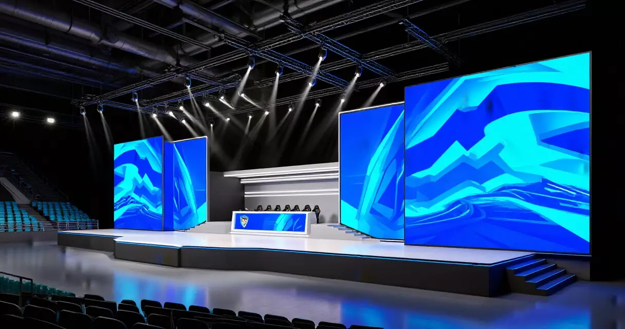
The technical demands of esports broadcast are distinct from traditional sports broadcast, and The New Company’s system was built with those demands in mind. A single global esports property like LoL Esports requires assets that work at arena scale — 30-meter LED walls behind the stage — and at mobile scale — a 375-pixel-wide phone screen streaming the same broadcast. Most traditional sports brand systems were built for print and standard broadcast before the social-media and mobile-first era; they required significant retrofitting to function in the digital native contexts that esports takes for granted.
The Engadget report from July 2020 noted that Riot’s rebrand messaging specifically called out web, video, and broadcast as the three primary touchpoints for the new system. That framing — web first, not print first — reflects how The New Company approached the design process. The identity was built in the order it would actually be experienced by the majority of the audience: digitally, on a screen, often at low resolution and high speed.
“A single blue palette and condensed typeface sounds minimal — but in a broadcast environment spanning 12 regions and five continents, that simplicity is exactly what allows consistency at scale.”
Comparison: LoL Esports vs. Other Major Esports Rebrands
The LoL Esports rebrand by The New Company can be usefully compared against other major esports identity projects from the same era to understand what made it distinctive. The LEC rebrand by Further Group, the Valorant Champions Tour visual system developed internally by Riot, and the Dota 2 Pro Circuit’s more event-driven approach all represent different strategies for building an esports brand architecture.
| Property | Studio | Approach | Palette | System Type |
|---|---|---|---|---|
| LoL Esports (Global) | The New Company | Unified global + regional sub-layers | Single bold blue | 10-year brand system |
| LEC (Europe) | Further Group | Regional identity + broadcast package | Distinct from global system | League-specific |
| Valorant Champions Tour | Riot internal | Event-and-tier hierarchy | Red and white primary | Event-driven system |
| Dota 2 Pro Circuit | Valve internal | Minimal centralized branding | Variable by event | Decentralized |

How Riot’s Leadership Shapes the Visual Identity Ecosystem
According to a Digital Gaming News report from August 2026, the principal architect behind Riot Games’ esports broadcast identity changes is John Needham, who leads a combined Publishing and Esports organization that integrates brand, production, platform technology, and music under one leadership chain. External partners including design agencies work within that structure, which explains both the coherence of the global LoL Esports system and the latitude given to regional studios like Further Group for the LEC. Needham’s unified leadership model is what allows The New Company’s system to function as a system rather than a collection of individually approved deliverables. This context is relevant to anyone following how esports representation and governance structures affect competitive brand decisions at the publisher level.
The Lasting Impact of The New Company’s LoL Esports Identity
As of August 2026, The New Company’s energetic identity system for LoL Esports remains the foundational visual language for the world’s largest professional esports ecosystem by total audience. The system has now operated across six consecutive Worlds championships, multiple MSI events, and the Hall of Legends inaugural ceremony — a track record that validates the original ten-year design ambition. For esports journalists and industry analysts, The New Company’s work is a case study in what happens when a major publisher invests in a true brand system rather than a logo refresh: the property gains visual authority that compounds over time, independent of which team wins or which meta dominates the competitive scene.
The LCS structural rebrands of 2025 and 2026 tested the system’s resilience, and the CHZZK venue partnership in Korea added a commercial naming layer that sits alongside the identity rather than replacing it. Both events demonstrated that a well-built brand system can absorb organizational change at the regional level without losing coherence at the global level — the central argument for investing in proper brand architecture rather than surface-level visual updates. Readers interested in how these broader identity questions play out across the competitive space may find the guide to esports identity in news reporting a useful companion piece.
| Milestone | Year | Detail | Source |
|---|---|---|---|
| LoL Esports rebrand reveal | 2020 | Single blue palette, Summoner’s Rift-inspired logo | Engadget / Inven Global |
| Full identity rollout | 2021 | The New Company project feature published | The Brand Identity |
| Hall of Legends identity | 2025 | Extension of 2021 system; motion graphics added | Bounty Hunters / The New Company |
| LCS name restored | 2026 | After LTA North experiment in 2025 | The Esports Advocate |
| CHZZK secures LCK rights | 2026 | LoL PARK rebranded to CHZZK LoL PARK | NAVER Corporation |
Frequently Asked Questions
Who is The New Company?
The New Company is a strategic design and marketing studio based in San Francisco. The studio describes its focus as being “in pursuit of the new,” and its client roster includes Riot Games, for whom it built both the global LoL Esports identity system and the Hall of Legends visual identity. Its work spans brand strategy, identity systems, and motion graphics.
When did The New Company’s LoL Esports identity launch?
Riot Games revealed the rebrand publicly in July 2020, with the system rolling out across the competitive ecosystem through 2021. The Brand Identity published its project feature on The New Company’s work in August 2021, confirming the full rollout was complete.
What is the primary color in The New Company’s LoL Esports identity?
The New Company reduced the palette to a single bold blue as the primary hue. This decision was deliberate — a single-color palette provides maximum consistency across 12 regional leagues and multiple broadcast partners, avoiding the fragmentation that comes from multi-color systems applied inconsistently across regions.
What typeface does the LoL Esports identity use?
The primary typeface is Compacta Regular. The condensed letterforms work at both large broadcast scale and small mobile-screen sizes, making it practical for a global esports property that needs to deliver consistent typography across widely varied production environments.
Does The New Company’s system cover the LEC, LCS, and LCK?
The New Company built the global LoL Esports brand layer — Worlds, MSI, and the overarching LoL Esports identity. The LEC has its own identity built by Further Group. The LCS and LCK operate under their own sub-identities, which exist within but are distinct from The New Company’s global system. Regional identity design is not a monolithic responsibility of one studio in Riot’s esports ecosystem.
What is the Hall of Legends, and how does it relate to The New Company?
The Hall of Legends is a LoL Esports initiative that ceremonially recognizes excellence in competitive League of Legends — similar in concept to sports halls of fame. Riot Games commissioned The New Company to design the visual identity and motion graphics system for the Hall of Legends in 2025, building on the studio’s 2021 global rebrand work. Caps became the first Western player inducted into the Hall of Legends, providing the inaugural event for the new identity system to debut on.
Sources
- The Brand Identity — The New Company’s energetic identity system for LoL Esports — Retrieved August 25, 2026
- Engadget — Here’s what the next 10 years of LoL Esports will look like — Retrieved August 25, 2026
- Inven Global — Riot Games reveals the rebrand of competitive League of Legends, LoL Esports — Retrieved August 25, 2026
- Further Group — Riot Games Esports Identity for Europe, LEC Rebrand — Retrieved August 25, 2026
- NAVER Corporation — CHZZK Acquires LCK Broadcast Rights, Rebrands LoL PARK — Retrieved August 25, 2026
- The Esports Advocate — Riot Dismantles LTA, Brings Back LCS and CBLoL — Retrieved August 25, 2026
- Bounty Hunters — Hall of Legends by The New Company — Retrieved August 25, 2026
- Wikipedia — League Championship Series (esports) — Retrieved August 25, 2026